This section introduces charting with pivots and groups from inside the grid using Pivot Chart.
Pivot Chart allow users to chart all grouped and pivoted data from inside the grid. When pivot mode is active in the grid, the pivot chart menu item will appear in the grid's context menu.
Using Pivot Chart Copy Link
Try it out on our demo page by doing the following:
- Enter Pivot Mode and select a combination of group, pivot and value columns.
- Bring up the Context Menu and select the desired chart type from the 'Pivot Chart' sub menu.
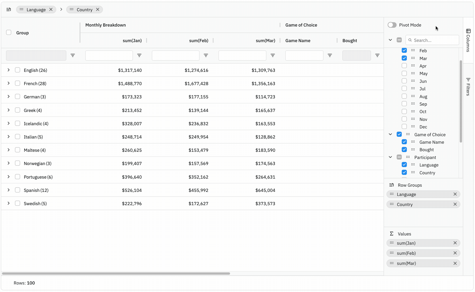
Notice from the demonstration above that all data is charted when using the Pivot Chart. Therefore, you will not be able to change the data selection range via Integrated Charts Tool Panel. Also note that the category axis will update to reflect the expanded group categories.