Floating Filters are an additional row under the column headers where the user will be able to see and optionally edit the filters associated with each column.
Floating filters are activated by setting the property floatingFilter = true on the colDef:
<ag-grid-angular
    [columnDefs]="columnDefs"
    /* other grid options ... */ />

this.columnDefs = [
    // column definition with floating filter enabled
    {
        field: 'country',
        filter: true,
        floatingFilter: true
    }
];
To have floating filters on for all columns by default, you should set floatingFilter on the defaultColDef. You can then disable floating filters on a per-column basis by setting floatingFilter = false on an individual colDef.
Floating filters depend on and co-ordinate with the main column filters. They do not have their own state, but rather display the state of the main filter and set state on the main filter if they are editable. For this reason, there is no API for getting or setting state of the floating filters.
Every floating filter takes a parameter to show/hide automatically a button that will open the main filter.
To see how floating filters work see Floating Filter Components.
The following example shows the following features of floating filters:
- Text filter: has out of the box read/write floating filter (Athlete and Sport columns)
- Set filter: has out of the box read-only floating filter (Country column)
- The 'Print Country' button prints the country filter model to the developer console.
- Date and Number filter: have out of the box read/write floating filters for all filters except when switching to in-range filtering, where the floating filter is read-only (Age and Date columns)
- Columns with
buttonscontaining'apply'require the user to press ↵ Enter on the floating filter for the filter to take effect (Gold column). (Note: this does not apply to floating Date Filters, which are always applied as soon as a valid date is entered.) - Changes made directly to the main filter are reflected automatically in the floating filters (change any main filter)
- The user can configure when to show/hide the button that shows the full filter (Silver and Bronze columns)
- The Year column has a filter, but has the floating filter disabled
- The Total column has no filter and therefore no floating filter either
Provided Floating Filters Copy Link
All the default filters provided by the grid provide their own implementation of a floating filter. All you need to do to enable these floating filters is set the floatingFilter = true column property. The features of the provided floating filters are as follows:
| Filter | Editable | Description |
|---|---|---|
| Text | Sometimes | Provides a text input field to display the filter value, or a read-only label if read-only. |
| Number | Sometimes | Provides a number input field to display the filter value (unless using Custom Number Support), or a read-only label if read-only. |
| Date | Sometimes | Provides a date input field to display the filter value, or a read-only label if read-only. |
| Set | No | Provides a read-only label by concatenating all selected values. |
The floating filters for Text, Number and Date (the simple filters) are editable when the filter has one condition and one value. If the floating filter has a) two or more conditions or b) zero (custom option) or two ('inRange') values, the floating filter is read-only.
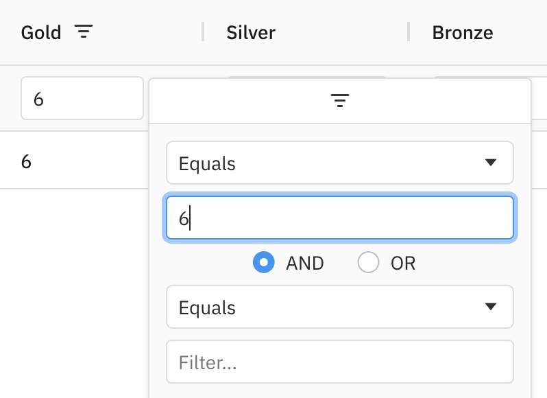
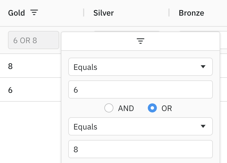
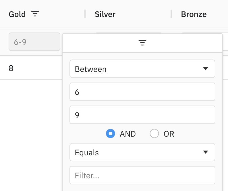
The screen shots below show example scenarios where the provided Number floating filter is editable and read-only.
One Value and One Condition - Editable
One Value and Two Conditions - Read-Only
Two Values and One Condition - Read-Only
Controlling Autocomplete on Floating Filters Copy Link
The Text and Number floating filters support overriding the browser's autocomplete behaviour on the filter's input field. You can control that autocomplete behaviour by passing browserAutoComplete parameter in floatingFilterComponentParams (as defined in ITextFloatingFilterParams and INumberFloatingFilterParams).
Possible values for browserAutoComplete:
trueto allow the browser's default autocomplete/autofill behaviour.falseto disable the browser autocomplete/autofill behaviour by setting theautocompleteattribute tooff.- A string to be used as the autocomplete attribute value.
By default, browserAutoComplete is set to false to disable autocomplete.
Some browsers do not respect setting the HTML attribute autocomplete="off" and display the auto-fill prompts anyway.
Placeholder Text on Floating Filters Copy Link
By default, no placeholder text is displayed in floating filter inputs. Placeholder text can be set using the filterPlaceholder property of floatingFilterComponentParams (as found in ITextFloatingFilterParams and INumberFloatingFilterParams):
Placeholder text for the filter textbox. When set to true, inherits the placeholder text of the parent filter.
|
Custom Floating Filters Copy Link
In addition to the floating filters provided by the grid, you can also create your own Custom Floating Filter Components.