Date Filters allow you to filter date data.
Enabling Date Filters Copy Link
The Date Filter is the default filter used in AG Grid Community for columns with date Cell Data Type, but it can also be explicitly configured as shown below:
<ag-grid-angular
    [columnDefs]="columnDefs"
    /* other grid options ... */ />

this.columnDefs = [
    {
        field: 'startDate',
        // Date Filter is used by default in Community version for date columns
        filter: true,
        filterParams: {
            // pass in additional parameters to the Date Filter
        },
    },
    {
        field: 'endDate',
        // explicitly configure column to use the Date Filter
        filter: 'agDateColumnFilter',
        filterParams: {
            // pass in additional parameters to the Date Filter
        },
    },
];
Date Filter Parameters Copy Link
Date Filters are configured through the filterParams attribute of the column definition (IDateFilterParams interface):
Defines whether the grid uses the browser date picker or a plain text box. true: Force the browser date picker to be used. false: Force a plain text box to be used. |
Specifies the buttons to be shown in the filter, in the order they should be displayed in. The options are: 'apply': If the Apply button is present, the filter is only applied after the user hits the Apply button. 'clear': The Clear button will clear the (form) details of the filter without removing any active filters on the column. 'reset': The Reset button will clear the details of the filter and any active filters on that column. 'cancel': The Cancel button will discard any changes that have been made to the filter in the UI, restoring the applied model. |
If the Apply button is present, the filter popup will be closed immediately when the Apply or Reset button is clicked if this is set to true. |
Required if the data for the column are not native JS Date objects. If cell values can contain invalid dates, should also implement isValidDate.
|
Overrides the default debounce time in milliseconds for the filter. Defaults are: TextFilter and NumberFilter: 500ms. (These filters have text field inputs, so a short delay before the input is formatted and the filtering applied is usually appropriate). DateFilter and SetFilter: 0ms |
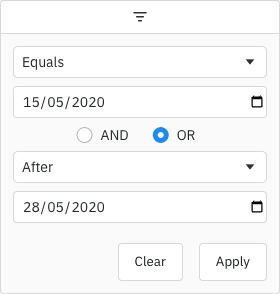
By default, the two conditions are combined using AND. You can change this default by setting this property. Options: AND, OR
|
The default filter option to be selected. |
Array of filter options to present to the user.
|
Placeholder text for the filter textbox.
|
Defines the date format for the floating filter text when an inRange filter has been applied. |
If true, the 'inRange' filter option will include values equal to the start and end of the range. |
If true, blank (null or undefined) values will pass the 'equals' filter option. |
If true, blank (null or undefined) values will pass the 'greaterThan' and 'greaterThanOrEqual' filter options. |
If true, blank (null or undefined) values will pass the 'lessThan' and 'lessThanOrEqual' filter options. |
If true, blank (null or undefined) values will pass the 'notEqual' filter option. |
If true, blank (null or undefined) values will pass the 'inRange' filter option. |
Defines whether time should be included when filtering dates. true: Include the time component in date comparisons. false: Only compare dates without considering the time component. |
If providing a comparator and cell values can contain invalid dates, this can be implemented to allow invalid date values to be filtered out (as the comparator only allows for greater than, less than and equals).
|
Maximum number of conditions allowed in the filter. |
The maximum valid date that can be entered in the filter. It can be a Date object or a string in the format YYYY-MM-DD. If set, this will override maxValidYear - the maximum valid year setting.
|
This is the maximum year that may be entered in a date field for the value to be considered valid. Default is no restriction. |
The minimum valid date that can be entered in the filter. It can be a Date object or a string in the format YYYY-MM-DD. If set, this will override minValidYear - the minimum valid year setting.
|
This is the minimum year that may be entered in a date field for the value to be considered valid. @default 1000 |
By default only one condition is shown, and additional conditions are made visible when the previous conditions are entered (up to maxNumConditions). To have more conditions shown by default, set this to the number required. Conditions will be disabled until the previous conditions have been entered. Note that this cannot be greater than maxNumConditions - anything larger will be ignored. |
If set to true, disables controls in the filter to mutate its state. Normally this would be used in conjunction with the Filter API. |
By default, the dateFrom and dateTo values in the filter model will be in the format YYYY-MM-DD hh:mm:ss. Set this to true to instead use the format YYYY-MM-DDThh:mm:ss.
|
Date Range Copy Link
The example below demonstrates configuring date range filtering in the Date Filter with minimum and maximum validation dates:
- For the Start Date column:
- The
minValidDateparameter is set to'2000-01-01'using a string. - The
maxValidDateis dynamically set to tomorrow's date using aDateobject.
- The
- For the End Date column:
- The
minValidYearparameter is set to2010. - The
maxValidYearparameter is set to2030.
- The
- Dates outside the valid ranges will be invalid.
Filter Comparator Copy Link
Dates can be represented in your data in many ways e.g. as a JavaScript Date object, as a string in a particular format such as '26-MAR-2020', or something else. How you represent dates will be particular to your application.
The Date Filter will automatically be configured to work correctly if the Cell Data Type is date, dateString, dateTime or dateTimeString.
If using Date objects, the default date comparator assumes that the Dates do not have a time (e.g. they are at midnight local time). If your dates have times, then you will either need to override the Filter Values to remove the time, to switch cell data type to dateTime, or provide a comparator that can handle the time.
If you are not using Cell Data Types (and the cell value is not a Date object, which will also work automatically), then a comparator needs to be configured to allow the Date Filter to perform the date comparisons.
Required if the data for the column are not native JS Date objects. If cell values can contain invalid dates, should also implement isValidDate.
|
The comparator function takes two parameters. The first parameter is a JavaScript Date object for the selected date in the filter (with the time set to midnight). The second parameter is the current value of the cell in the row being evaluated. The function must return:
- Any number < 0 if the cell value is less than the filter date.
- 0 if the dates are the same.
- Any number > 0 if the cell value is greater than the filter date.
This pattern is intended to be similar to the JavaScript compareTo(a, b) function.
A date filter with a comparator can be configured similar to the following:
<ag-grid-angular
    [columnDefs]="columnDefs"
    /* other grid options ... */ />

this.columnDefs = [
    // column definition configured to use a date filter
    {
        field: 'date',
        filter: 'agDateColumnFilter',
        // add extra parameters for the date filter
        filterParams: {
            // provide comparator function
            comparator: (filterLocalDateAtMidnight, cellValue) => {
                const dateAsString = cellValue;

                if (dateAsString == null) {
                    return 0;
                }

                // In the example application, dates are stored as dd/mm/yyyy
                // We create a Date object for comparison against the filter date
                const dateParts = dateAsString.split('/');
                const year = Number(dateParts[2]);
                const month = Number(dateParts[1]) - 1;
                const day = Number(dateParts[0]);
                const cellDate = new Date(year, month, day);

                // Now that both parameters are Date objects, we can compare
                if (cellDate < filterLocalDateAtMidnight) {
                    return -1;
                } else if (cellDate > filterLocalDateAtMidnight) {
                    return 1;
                }
                return 0;
            }
        }
    }
];
Once the date comparator callback is provided, then the Date Filter is able to perform all the comparison operations it needs, e.g. 'Less Than', 'Greater Than' and 'Equals'.
If the cell values can contain invalid dates, then the isValidDate filter param should be implemented alongside comparator to allow the invalid date values to be filtered out.
The example below demonstrates configuring a comparator:
Filter Model Copy Link
The Filter Model describes the current state of the applied Date Filter. The Date Filter Model represents the Date as a string in format 'YYYY-MM-DD', however when doing comparisons the date is provided as a JavaScript Date object as that's what date pickers typically work with. The model uses string representation to make it easier to save and avoid any timezone issues.
If only one Filter Condition is set, this will be a DateFilterModel:
Filter type is always 'date' |
The date value(s) associated with the filter. The type is string and the format is YYYY-MM-DD hh:mm:ss, e.g. 2019-05-24 00:00:00. If useIsoSeparator = true, the format is instead YYYY-MM-DDThh:mm:ss. Custom filters can have no values (hence both are optional). Range filter has two values (from and to).
|
Range filter to date value.
|
One of the filter options, e.g. 'equals' |
If more than one Filter Condition is set, then multiple instances of the model are created and wrapped inside a Combined Model (ICombinedSimpleModel<DateFilterModel>). A Combined Model looks as follows:
// A filter combining multiple conditions
interface ICombinedSimpleModel<DateFilterModel> {
    filterType: string;

    operator: JoinOperator;

    // multiple instances of the Filter Model
    conditions: DateFilterModel[];
}

type JoinOperator = 'AND' | 'OR';
An example of a Filter Model with two conditions is as follows:
// Date Filter with two conditions, both are equals type
const dateEquals04OrEquals08 = {
    filterType: 'date',
    operator: 'OR',
    conditions: [
        {
            filterType: 'date',
            type: 'equals',
            dateFrom: '2004-08-29'
        },
        {
            filterType: 'date',
            type: 'equals',
            dateFrom: '2008-08-24'
        }
    ]
};
Filter Options Copy Link
The Date Filter presents a list of Filter Options to the user.
The list of options is as follows:
| Option Name | Option Key | Included by Default |
|---|---|---|
| Equals | equals | Yes |
| Does not equal | notEqual | Yes |
| Before | lessThan | Yes |
| After | greaterThan | Yes |
| Between | inRange | Yes |
| Blank | blank | Yes |
| Not blank | notBlank | Yes |
| Choose one | empty | No |
Note that the empty filter option is primarily used when creating Custom Filter Options. When 'Choose one' is displayed, the filter is not active.
The default option for the Date Filter is equals.
When providing filter options, the default filter option (or the first option if no default set) must be an option that displays an input or the empty filter option (as a filter option with no inputs would mean the filter is active by default).
Built-in Named & Relative Date Ranges Copy Link
Date Filter supports a set of predefined named and relative date ranges to make common filtering tasks easier. These ranges are relative to the browser local time. These are ideal for users who want to filter by familiar time periods like "Last Week", "Year to Date", or "Next 30 Days" without extending a grid with a custom solution.
Built-in named and relative date ranges are evaluated using the browser’s local time zone, not server time. This means results can differ between users in different time zones, and results can change when the local date changes and the filter is re-applied.
Week-based ranges (such as thisWeek and lastWeek) use the first day of the week from the browser’s locale settings. If the locale does not provide this information, Monday is used.
Enabling Built-in Date Ranges Copy Link
To enable the built-in date ranges, add them to the filterOptions array in your date filter configuration. The options are not included by default.
Example: Enable Built-in Date Ranges Copy Link
Example above uses following configuration:
// Enable built-in date ranges
const columnDefs: ColDef[] = [
  {
    filter: 'agDateColumnFilter',
    filterParams: {
      // Enable built-in named & relative date ranges
      filterOptions: [
        'empty', // optional: show 'Choose one' option first
        'yesterday',
        'today',
        'tomorrow',
        'last7Days',
        'lastWeek',
        'thisWeek',
        'nextWeek',
        'last30Days',
        'lastMonth',
        // ... All other preset ranges
      ],
      // Other filter settings...
    },
  },
];
Available Built-in Date Filter Options Copy Link
| Option Name | Option Key | Time Range Start >= | Time Range End < |
|---|---|---|---|
| Today | today | Start Of Today | Start Of Tomorrow |
| Yesterday | yesterday | Start Of Yesterday | Start Of Today |
| Tomorrow | tomorrow | Start Of Tomorrow | Start Of Day After Tomorrow |
| This Week | thisWeek | Start Of Current Week | Start Of Next Week |
| Last Week | lastWeek | Start Of Previous Week | Start Of Current Week |
| Next Week | nextWeek | Start Of Next Week | Start Of Week After Next |
| This Month | thisMonth | Start Of Current Month | Start Of Next Month |
| Last Month | lastMonth | Start Of Previous Month | Start Of Current Month |
| Next Month | nextMonth | Start Of Next Month | Start Of Month After Next |
| This Quarter | thisQuarter | Start Of Current Quarter | Start Of Next Quarter |
| Last Quarter | lastQuarter | Start Of Previous Quarter | Start Of Current Quarter |
| Next Quarter | nextQuarter | Start Of Next Quarter | Start Of Quarter After Next |
| This Year | thisYear | Start Of Current Year | Start Of Next Year |
| Last Year | lastYear | Start Of Previous Year | Start Of Current Year |
| Next Year | nextYear | Start Of Next Year | Start Of Year After Next |
| Year to Date (YTD) | yearToDate | Start Of Current Year | Start Of Tomorrow |
| Last 7 Days | last7Days | Start of the day 7 days before today | Start Of Tomorrow |
| Last 30 Days | last30Days | Start Of Today minus 30 days | Start Of Tomorrow |
| Last 90 Days | last90Days | Start Of Today minus 90 days | Start Of Tomorrow |
| Last 6 Months | last6Months | Start Of Today minus 6 months | Start Of Tomorrow |
| Last 12 Months | last12Months | Start Of Today minus 12 months | Start Of Tomorrow |
| Last 24 Months | last24Months | Start Of Today minus 24 months | Start Of Tomorrow |
Start Of Today, Start Of Tomorrow, Start Of XXX point to the beginning of the corresponding day, e.g. 00:00:00.000 in the browser’s local time zone.
For date range filters, the Grid State model matches the SSRM request model shape. See SSRM Preset Date Range Filters for the server-side filtering contract.
Range Input Validation and Error States Copy Link
When using the inRange filter type, the grid performs input validation to ensure the bounds of the range produce a valid filter; that is, where the start date is earlier than the end date.
Where this is not the case, the last edited input will display a red border and a hover tooltip directing the user to enter a valid date. While the filter is in an invalid state, the filter will not be applied. Screen readers that respond to the aria-invalid attribute or the ValidityState of the input will detect the input as invalid.
Filter Values Copy Link
By default, the values supplied to the Date Filter are retrieved from the data based on the field attribute. This can be overridden by providing a filterValueGetter in the Column Definition. This is similar to using a Value Getter, but is specific to the filter.
Function or expression. Gets the value for filtering purposes. |
Date Selection Component Copy Link
By default the grid will use the browser-provided date picker for all Supported Browsers, but for other browsers it will provide a simple text field. To override this and provide a custom date picker, see Date Component.
It is also possible to enable a native date picker for unsupported browsers by setting filterParams.browserDatePicker = true. However, you will need to test this behaviour yourself.
Custom Selection Component Copy Link
You can provide a Date Selection Component to replace the default.
The example below shows how to register a custom date component that contains an extra floating calendar picker rendered from the filter field. The problem with this approach is that we have no control over third party components and therefore no way to implement a preventDefault when the user clicks on the Calendar Picker (for more info see Custom Floating Filter Example). Our way of fixing this problem is to add the ag-custom-component-popup class to the floating calendar.
The interface for a custom date component is as follows:
interface IDateAngularComp {
  // Mandatory - Params for rendering this component.
  agInit(params: IDateParams): void;

  // Returns the current date represented by this component
  getDate(): Date  |  null;

  // Sets the date represented by this component
  setDate(date: Date | null): void;

  // When used in a floating filter, a hook to perform any necessary operations
  // when the column definition is updated.
  refresh?(params: IDateParams): void;

  // Optional: Sets the disabled state of this component
  setDisabled?(disabled: boolean): void;

  // Optional: Sets the current input placeholder
  setInputPlaceholder?(placeholder: string): void;

  // Optional: Sets the current input aria label
  setInputAriaLabel?(placeholder: string): void;

  // Optional: A hook to perform any necessary operation just after
  // the GUI for this component has been rendered on the screen.
  // If a parent popup is closed and reopened (e.g. for filters),
  // this method is called each time the component is shown.
  // This is useful for any logic that requires attachment before executing,
  // such as putting focus on a particular DOM element.
  afterGuiAttached?(params?: IAfterGuiAttachedParams): void;

}
The agInit(params) method takes a params object with the items listed below:
Properties available on the IDateParams<TData = any, TContext = any> interface.
Method for component to tell AG Grid that the date has changed. |
DateFilterParams |
'filter' | 'floatingFilter' |
Method for component to tell AG Grid that an input has been focussed. Used by the grid to refresh validation messages when moving between inputs in an "inRange" filter.
|
The grid api. |
Application context as set on gridOptions.context. |
Applying the Filter Copy Link
Applying the Date Filter is described in more detail in the following sections:
Blank Cells Copy Link
If the row data contains blanks (i.e. null or undefined), by default the row won't be included in filter results. To change this, use the filter params includeBlanksInEquals, includeBlanksInNotEqual, includeBlanksInLessThan, includeBlanksInGreaterThan and includeBlanksInRange. For example, the code snippet below configures a filter to include null for equals, but not for less than, greater than or in range (between):
const filterParams = {
    includeBlanksInEquals: true,
    includeBlanksInNotEqual: false,
    includeBlanksInLessThan: false,
    includeBlanksInGreaterThan: false,
    includeBlanksInRange: false,
};
In the following example you can filter by date and see how blank values are included. Note the following:
- Column Date has both
nullandundefinedvalues resulting in blank cells. - Toggle the controls on the top to see how
includeBlanksInEquals,includeBlanksInNotEqual,includeBlanksInLessThan,includeBlanksInGreaterThanandincludeBlanksInRangeimpact the search result.
Data Updates Copy Link
The Date Filter is not affected by data changes. When the grid data is updated, the filter value will remain unchanged and the filter will be re-applied based on the updated data (e.g. the displayed rows will update if necessary).